2020-05-10, 21:24
(This post was last modified: 2020-05-13, 05:13 by gerbold.
Edit Reason: typo
)
Hello Egon,
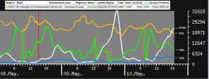
I've some doubts regarding the statistics_1 diagram.

1) Does the description of the line colors match the values used for the calculation?
There are four lines in the diagram:
- signals (max = n)
- strikes/signals
- involved/strikes
- used/involved
There are two scales at the diagram:
- left hand percentage form 0% to 100%
- right hand signal count from 0 to n
Thus I expect the right scale to be valid for the signals graph amd the left scale with the percentage to be valid for the three other graphs.
At UTC 2020-05-10 18_29 I took a snapshot of the statistics_1 diagram and of the satitons list figures.
Based on the pixels I calculated the percentages in the graph and based on the figures I calculated the expected percentages. They differ greatly.
The percentages sudenly start to match, when I chose different calculations.
valid/total = 11986/20887 = 57% = yellow = 69px/121px = 57%
involved/total = 5440/20887 = 26% = green = 32px/121px = 26%
used/total = 2208/20887 = 11% ~ blue = 14px/121px = 12%
Is this just coincidence or is the legend partially wrong?
yellow is documented as strikes/signals, but it seems to be valid/total
green is documented as invlolved/strikes, but it seems to be invlolved/total
blue is documented as used/involved, but it seems to be used/total
2) There are sudden drops ot the green line to zero. See May 8th 9am, May 9th 1pm and 6pm, May 10th 8pm.
I'd possibly understand this if there would be interference and the station would suddenly send only unusable signals, but there was no sign of a malfunction.
The most extreme example is at May 8th 9am.
For more than two hours all valid signals have been also regarded as involved signals.
Then in the next moment zero of the valid signals have been involved.
How can this behaviour be explained?
Klaus
I've some doubts regarding the statistics_1 diagram.
1) Does the description of the line colors match the values used for the calculation?
There are four lines in the diagram:
- signals (max = n)
- strikes/signals
- involved/strikes
- used/involved
There are two scales at the diagram:
- left hand percentage form 0% to 100%
- right hand signal count from 0 to n
Thus I expect the right scale to be valid for the signals graph amd the left scale with the percentage to be valid for the three other graphs.
At UTC 2020-05-10 18_29 I took a snapshot of the statistics_1 diagram and of the satitons list figures.
Based on the pixels I calculated the percentages in the graph and based on the figures I calculated the expected percentages. They differ greatly.
The percentages sudenly start to match, when I chose different calculations.
valid/total = 11986/20887 = 57% = yellow = 69px/121px = 57%
involved/total = 5440/20887 = 26% = green = 32px/121px = 26%
used/total = 2208/20887 = 11% ~ blue = 14px/121px = 12%
Is this just coincidence or is the legend partially wrong?
yellow is documented as strikes/signals, but it seems to be valid/total
green is documented as invlolved/strikes, but it seems to be invlolved/total
blue is documented as used/involved, but it seems to be used/total
2) There are sudden drops ot the green line to zero. See May 8th 9am, May 9th 1pm and 6pm, May 10th 8pm.
I'd possibly understand this if there would be interference and the station would suddenly send only unusable signals, but there was no sign of a malfunction.
The most extreme example is at May 8th 9am.
For more than two hours all valid signals have been also regarded as involved signals.
Then in the next moment zero of the valid signals have been involved.
How can this behaviour be explained?
Klaus


